MCP UI Kit
Build interactive React UIs for MCP tools.
The Model Context Protocol (MCP) enables AI assistants to interact with external tools and data. The mcp-ui project extends this with rich, interactive UI components that can be rendered directly in the AI chat.
mcp-ui-kit simplifies building these UI components by:
- Bundling on-demand — Write React components, they're bundled automatically when the tool is called
- Zero config — No webpack/vite setup needed, just
createUI()and point to your.tsxfile - Props from server — Pass data from your MCP tool directly to React via
useProps() - Two-way communication — Components can
sendPrompt()to the AI orcallTool()to invoke other MCP tools
Built on top of @mcp-ui/server.
Installation
npm install mcp-ui-kit @modelcontextprotocol/sdk
Server Usage
Create UI components that bundle on-demand within your MCP server:
import { McpServer } from '@modelcontextprotocol/sdk/server/mcp.js';
import { StdioServerTransport } from '@modelcontextprotocol/sdk/server/stdio.js';
import { createUI } from 'mcp-ui-kit/server';  // 👈 mcp-ui-kit

// Create the MCP server
const server = new McpServer({
  name: 'my-server',
  version: '1.0.0'
});

// Create a UI component                        // 👈 mcp-ui-kit
const dashboardUI = createUI(                   // 👈 mcp-ui-kit
  'my-dashboard',                               // 👈 mcp-ui-kit
  import.meta.resolve('./MyComponent.tsx')      // 👈 mcp-ui-kit
);                                              // 👈 mcp-ui-kit

// Register a tool with the UI
server.registerTool(
  'dashboard',
  {
    description: 'Interactive dashboard',
    _meta: dashboardUI.meta                     // 👈 mcp-ui-kit
  },
  async () => ({
    content: [
      { type: 'text', text: 'Dashboard loaded' },
      await dashboardUI.component({             // 👈 mcp-ui-kit
        props: { title: 'Hello' },              // 👈 mcp-ui-kit
        frameSize: ['700px', '500px']           // 👈 mcp-ui-kit
      })                                        // 👈 mcp-ui-kit
    ]
  })
);

// Start the server
const transport = new StdioServerTransport();
await server.connect(transport);
With Input Schema
Tools can accept parameters via inputSchema and pass them to your UI component:
import { z } from 'zod';
import { createUI } from 'mcp-ui-kit/server';  // 👈 mcp-ui-kit

const stockUI = createUI('stocks', import.meta.resolve('./StockDashboard.tsx'));  // 👈 mcp-ui-kit

server.registerTool(
  'stock_portfolio',
  {
    description: 'View stock portfolio with charts',
    _meta: stockUI.meta,                                             // 👈 mcp-ui-kit
    inputSchema: {
      symbols: z.array(z.string()).default(['AAPL', 'GOOGL']),
      timeframe: z.enum(['1D', '1W', '1M', '1Y']).default('1M'),
    },
  },
  async ({ symbols, timeframe }) => ({
    content: [
      { type: 'text', text: `Showing ${symbols.join(', ')} for ${timeframe}` },
      await stockUI.component({                                      // 👈 mcp-ui-kit
        props: { symbols, timeframe },                               // 👈 mcp-ui-kit (params → props)
      })
    ]
  })
);
Client Usage
Helper functions for your React components (the ones you pass to createUI):
// StockDashboard.tsx
import { useState } from 'react';
import { sendPrompt, callTool, useProps } from 'mcp-ui-kit/ui';  // 👈 mcp-ui-kit

function StockDashboard() {
  const [analysis, setAnalysis] = useState<string | null>(null);

  // Get props passed from server (matches inputSchema params)        // 👈 mcp-ui-kit
  const { symbols, timeframe } = useProps({                           // 👈 mcp-ui-kit
    symbols: ['AAPL'],                                                // 👈 mcp-ui-kit
    timeframe: '1M'                                                   // 👈 mcp-ui-kit
  });                                                                 // 👈 mcp-ui-kit

  const handleAnalyze = (symbol: string) => {
    // Send a message to the AI chat                                  // 👈 mcp-ui-kit
    sendPrompt(`Analyze ${symbol} stock performance over ${timeframe}`);  // 👈 mcp-ui-kit
  };

  const handleRefresh = async (symbol: string) => {
    // Call another MCP tool                                          // 👈 mcp-ui-kit
    callTool('get_stock_price', { symbol });                          // 👈 mcp-ui-kit
  };

  return (
    <div>
      <h1>Stock Portfolio ({timeframe})</h1>
      {symbols.map(symbol => (
        <div key={symbol}>
          <span>{symbol}</span>
          <button onClick={() => handleAnalyze(symbol)}>
            Ask AI to Analyze
          </button>
          <button onClick={() => handleRefresh(symbol)}>
            Refresh Price
          </button>
        </div>
      ))}
    </div>
  );
}
MCP UI Inspector
The MCP UI Inspector is a developer tool for testing MCP servers with UI capabilities. It provides a visual interface to:
- Connect to MCP servers — Enter your server URL and establish a connection
- Browse available tools — See all registered tools and their descriptions
- Configure parameters — Fill in tool input schemas with a form UI or raw JSON
- Execute tools — Run tools and see both text and UI responses
- Preview UI components — View your React components rendered in real-time with full interactivity
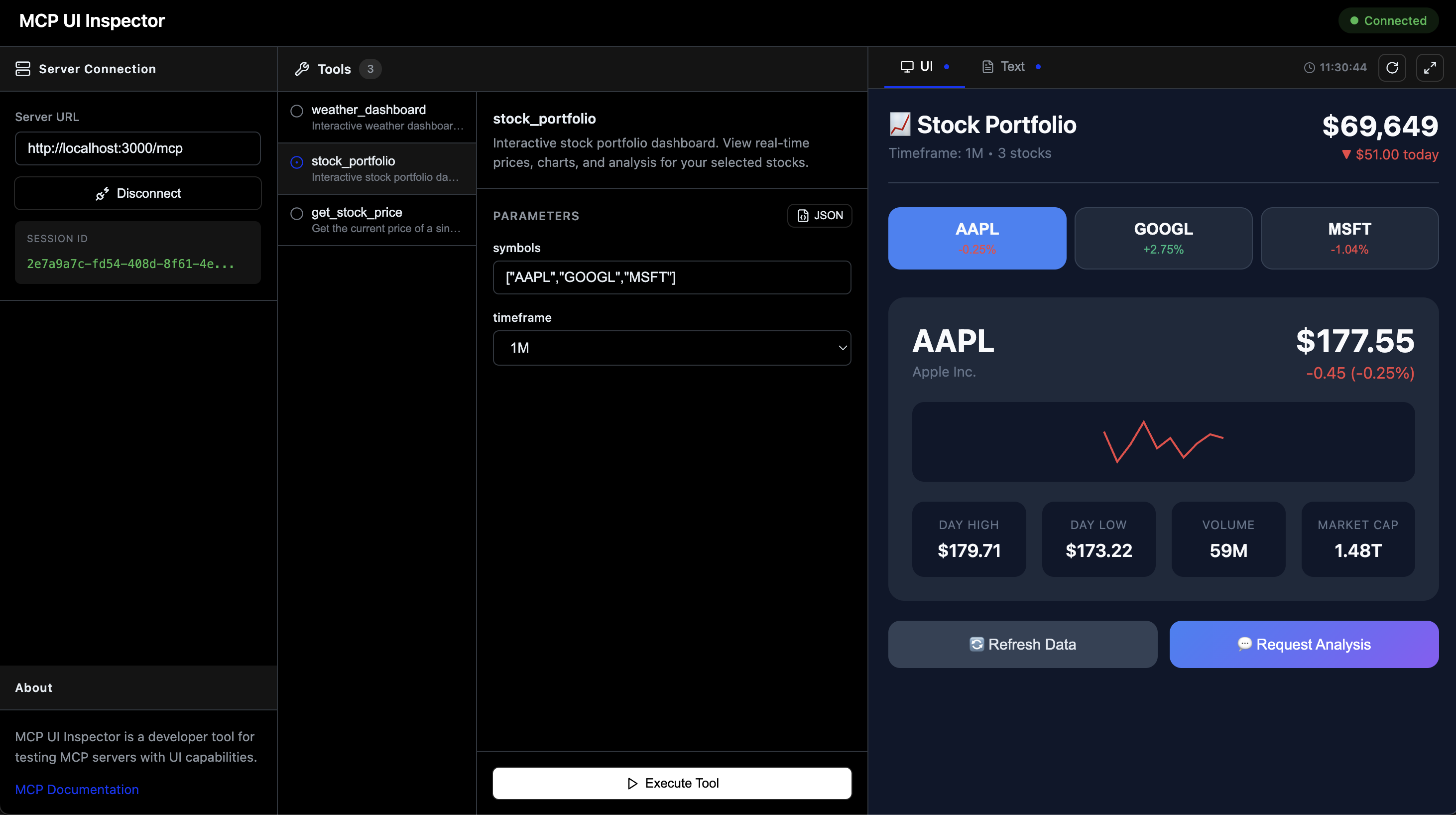
The inspector makes it easy to iterate on your UI components without needing a full AI chat client. You can test sendPrompt() and callTool() interactions, verify props are passed correctly, and debug your components in isolation.
API
Server (mcp-ui-kit/server)
createUI(name, entryUrl) - Creates a UI component
name: Component identifier (used in theui://URI)entryUrl: Path to the component entry file- Returns:
{ meta, component(opts?) }meta: Object to spread into tool's_metafor UI resource linkingcomponent(opts?): Async function returning the UI resourceopts.props: Data to pass to your React componentopts.frameSize:[width, height]e.g.['700px', '500px']
The entryUrl parameter accepts both formats:
// ESM (recommended) - using import.meta.resolve()
createUI('dashboard', import.meta.resolve('./MyComponent.tsx'));

// CommonJS - using require.resolve() or absolute paths
createUI('dashboard', require.resolve('./MyComponent.tsx'));
createUI('dashboard', path.join(__dirname, './MyComponent.tsx'));
UI (mcp-ui-kit/ui)
useProps(defaults)- Get props passed from the server viacomponent({ props })sendPrompt(message)- Send a message to the AI chatcallTool(name, params)- Invoke an MCP tool
Development
npm install
npm run dev:all  # Start demo server + inspector